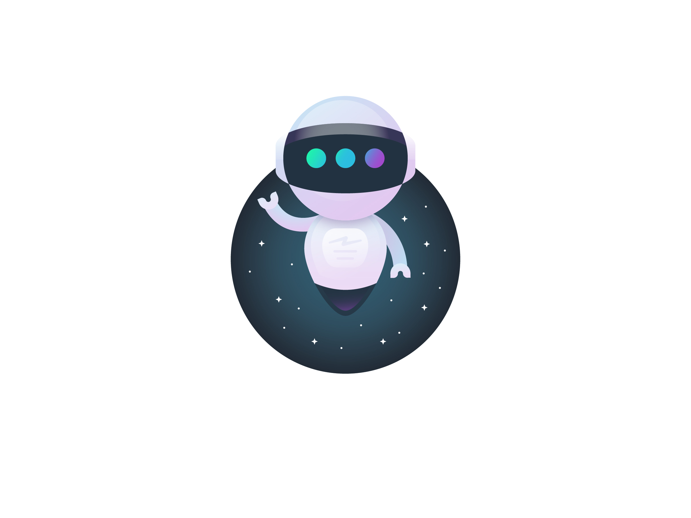


ASTRObot character
I partnered with the team at Astro, an AI based email technology to extend their brand by creating a character that could be used throughout their product and branding materials to explain who they were, what Astro did and guide users through the functions of their products. That process gave birth to Astrobot, a friendly and approachable persona that greeted, assisted and guided users through AI driven interfaces in efforts to better manage email.
Shortly after the launch of Astrobot, Astro was acquired by Slack.

step 1: sketches
The name Astro immediately implies a space theme and while we wanted to stay true to that we needed to explore a range of characters in order to figure out what felt best as a representative of the overall brand. Human and animal characters added a level of approachability but lacked the connection to the AI functions of the primary product. While hyper-intelligent alien species seemed appealing they were eventually deemed too cartoon-esque and we settled in the direction of a friendly yet powerful robot there to help you on your email journey.

step 2: STYLE
Once an initial direction was established we did some early style tests to see what aesthetics were jiving with the design of the product while continuing to develop the style and personal of the character. We needed something that could express emotions people would relate too without seeming too much like a human but also be seen as something that could handle powerful computing processes to solve complex tasks.

step 3: REFINEMENTS
Once we had a stronger lock on a direction we started testing it out in all of the different scenarios it would be used in. Just within mobile apps there were a range of sizes and requirements for things like different platforms and various implementations from buttons to chat windows to very small icons in sidebar menus.

step 4: POLISH
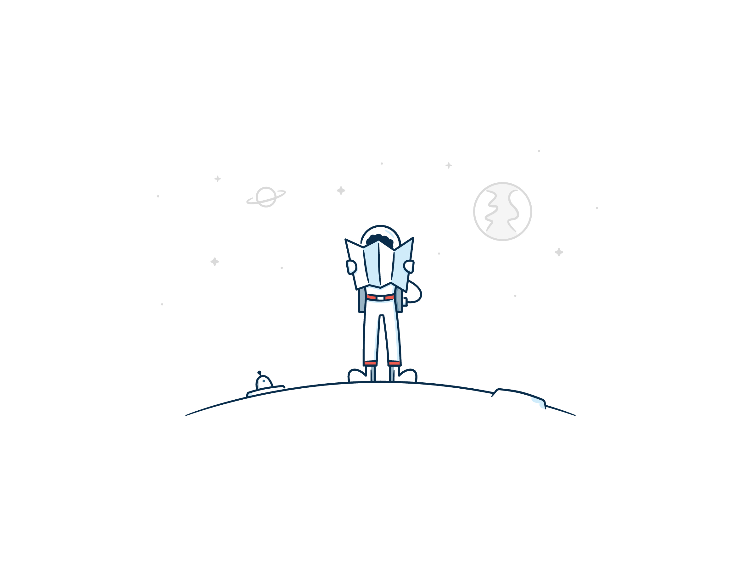
Having established the overall personality by developing the face of the character, which is what would be used most often, we adapted the style to a full body character following the same guiding personality principles. We also explored a few different visual styles that were built around both the full color and line drawn versions used throughout the product.
From there it was finessing fine details like lighting, shading color and visual nuances before we fully resolved the appearance of Astrobot.


step 5: IMPLEMENTATION
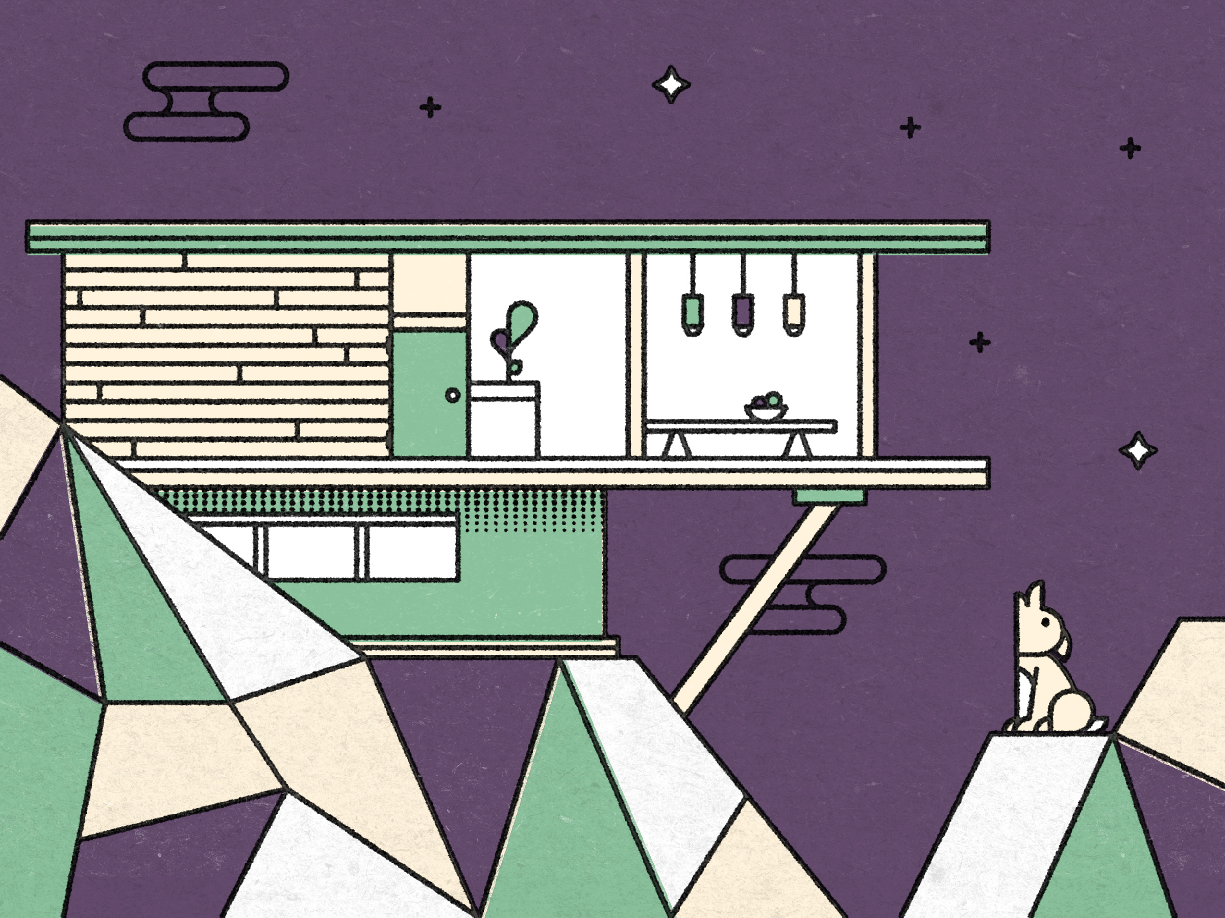
Once Astrobot had been born and fully developed it found a home all over the product and we had particular fun developing some of the empty and error states for occasions like clearing your inbox or searching through emails. Astrobot also traveled throughout marketing materials, websites and promotional videos as the company continued to develop and expand their product offerings.


🚀